PepsiCo: Neon Zebra
Company: PepsiCo
Role: Lead Designer / Creative Direction
2021
The Challenge
PepsiCo wanted Neon Zebra to break into the ready-to-drink mixer category with the same boldness as its name. The ask was clear but complex: create a visual identity that could instantly grab attention, feel fun and rebellious, and cut through the crowded beverage landscape. At the same time, the brand had to be flexible enough to work across dozens of touchpoints — from motion ads and digital takeovers to print, retail, and social campaigns. The challenge was to find the sweet spot between wild energy and brand clarity, making Neon Zebra impossible to ignore while staying usable in real-world marketing.
Brand Identity and Elements

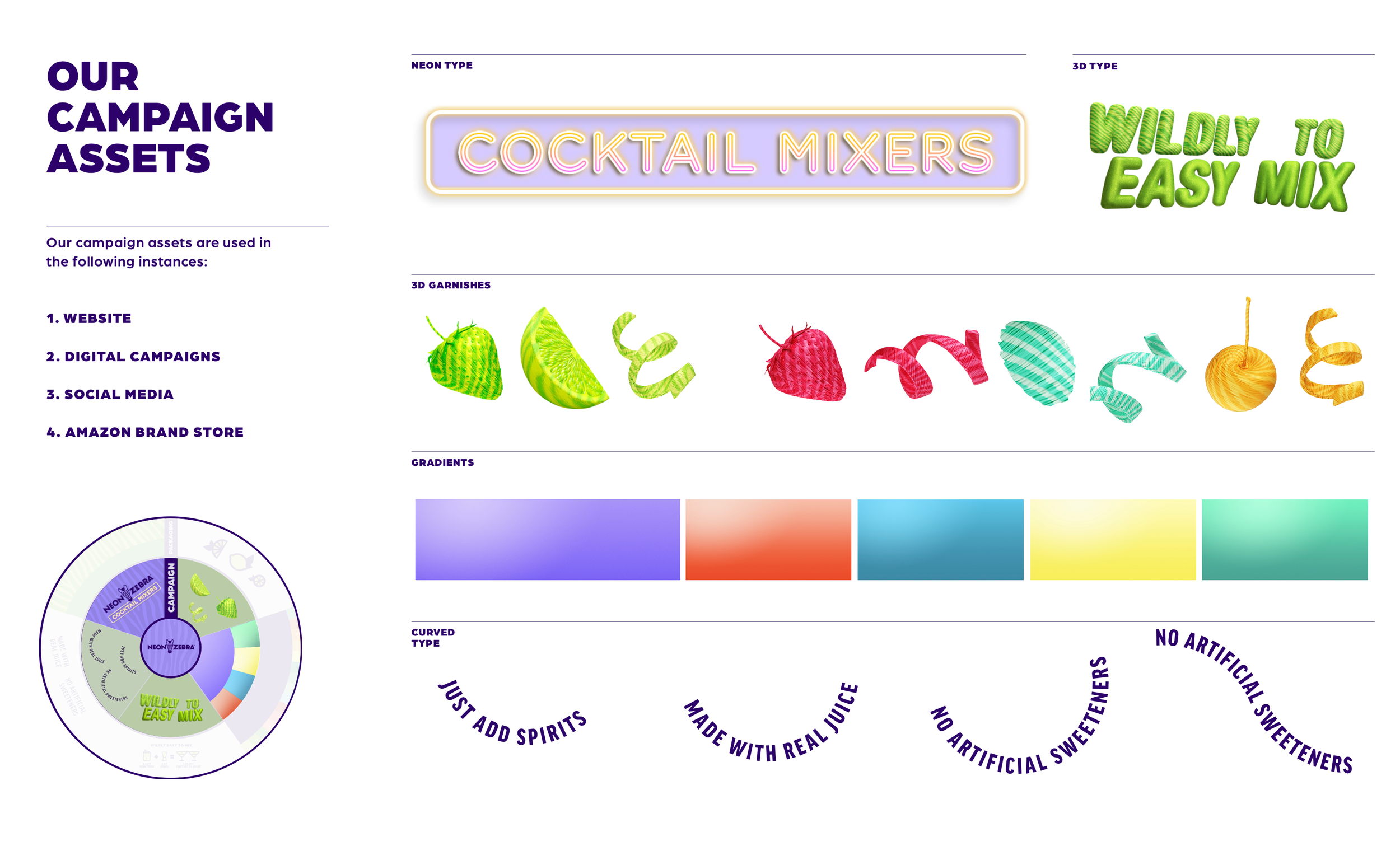
One of the key challenges was organizing the wide range of visual ingredients that made up the Neon Zebra identity. The system included multiple illustration styles, 3D objects, gradients, zebra patterns, and a bold color palette — all of which needed structure to stay cohesive. To bring clarity, we created a tiered brand wheel that separated elements into two categories: campaign and digital assets, and packaging and print assets. Campaign assets included 3D garnishes, a neon-inspired type treatment, and gradients tailored to each flavor. Packaging and print leaned on a four-color palette per flavor and flat illustrations, ensuring consistency across shelf and physical touchpoints. Together, this framework kept the brand expressive without ever feeling chaotic.

Key Visuals and Product Stacking
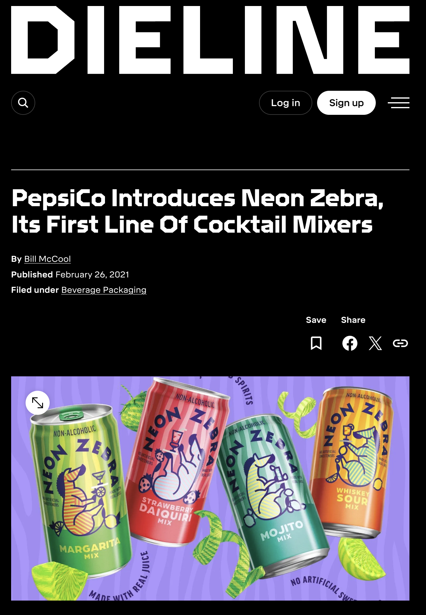
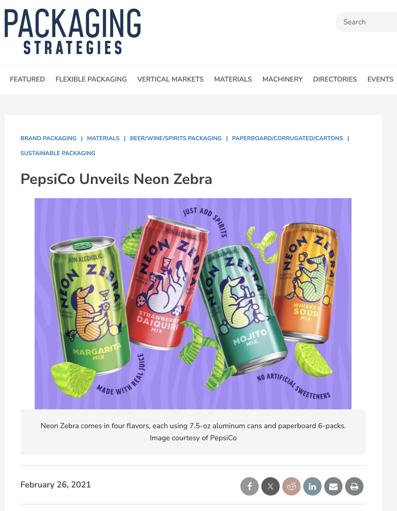
The flavor system was built to make each variety of Neon Zebra instantly recognizable while still feeling cohesive as a family. Margarita was positioned as the hero flavor, both in prominence and in color assignment, reflecting our prediction that it would be the best seller. Each flavor was paired with a primary color inspired by the drink itself — green for Margarita, red for Strawberry Daiquiri, mint for Mojito, and amber for Whiskey Sour — balanced with a bold contrasting accent from the broader palette to heighten visibility. To reinforce consistency across touchpoints, we established a fixed stacking order for multi-flavor displays, always leading with Margarita followed by the supporting flavors. This approach ensured that the lineup felt vibrant, intentional, and instantly legible in both digital and retail contexts.


Print and Packaging
For the 12-pack canned boxes, I designed a flavor profile and recipe insert that highlighted each variety while reinforcing Neon Zebra’s playful identity. The insert had to be square to fit within the packaging, so I leaned into that constraint as a design device — creating a 4x4 grid of panels that featured each flavor alongside its recipe. At the center, I placed a branded cocktail equation — 1 can + 3 oz of liquor = 2 delicious cocktails — turning a simple insert into both a functional guide and a bold piece of brand storytelling. The result was a layout that felt organized, eye-catching, and instantly useful to consumers.

Retail and Brand Partnerships
A major part of my role was developing the visual framework for how Neon Zebra appeared alongside brand partners in retail environments. I created guidelines for logo alignment, spacing, and hierarchy to ensure our identity paired seamlessly with partner brands, as well as standards for how our cans should be placed next to complementary spirits like tequila and whiskey. Our first major partnership with Diageo marked a first-of-its-kind activation for Neon Zebra: I designed a retail shopper for Kroger stores that paired Neon Zebra Margarita with Don Julio Tequila and Neon Zebra Whiskey Sour with Bulleit Whiskey. This display brought the partnership to life in a bold, cohesive, and shoppable way. In addition to design, I managed communications and production with the print vendor to ensure flawless execution from concept to in-store launch.


Motion Graphics and Animation Inspiration
I established the motion language that brought Neon Zebra’s bold aesthetic to life. Building on the brand’s oversized 3D type, hyper-realistic ingredient elements, and spirals of peels and rinds, I wanted every animation to feel playful, inflated, and impossible to ignore. Elements ballooned, popped, coiled, and floated across the screen, often moving through z-space to create depth by shifting between foreground and background. The effect was intentionally maximalist — reminiscent of the in-your-face beverage ads of the 90s, but updated with a modern, digital polish. I created the initial inspiration and first round of animations, which were later refined and scaled by a 3D animation agency partner. Together, this motion system gave Neon Zebra the energy and attitude it needed to stand out in fast-moving digital environments.
Neon Zebra in the Press